← All works

Intuit Mailchimp. Improving pricing plan selection for 11% increased conversions

Growth experiments

A/B testing

Internship

Shipped  

Context

As Mailchimp expanded into a full marketing platform, its growing feature set made pricing harder to navigate. We aimed to simplify the plan selection experience to boost acquisition and revenue. A clear pricing experience builds trust, reduces friction, and supports self-serve growth by helping users find the right plan without needing sales

Project overview

I tackled three milestones for Mailchimp.com—the front door to customer acquisition—balancing speed and quality under tight deadlines while proposing forward-looking ideas for long-term planning

1. I supported milestone 1&3 while leading milestone 2 by executing and iterating on designs through multiple rounds of user testing
2. Proposing new design directions, some of which are now on the product roadmap
3. Identifying and resolving dark patterns uncovered during testing
4. With the holiday season approaching, I ensured all planned experiments shipped on time—navigating tight timelines and engineering constraints without compromising design clarity.
5. Contributed to a site-wide visual language upgrade

My role
Product design intern

Time
6 months, 2022

What I did
UX research,
UX design,
Visual design,
Responsive design

Collaboration
Design manager, product, marketing, content, research, engineering, data, visual teams

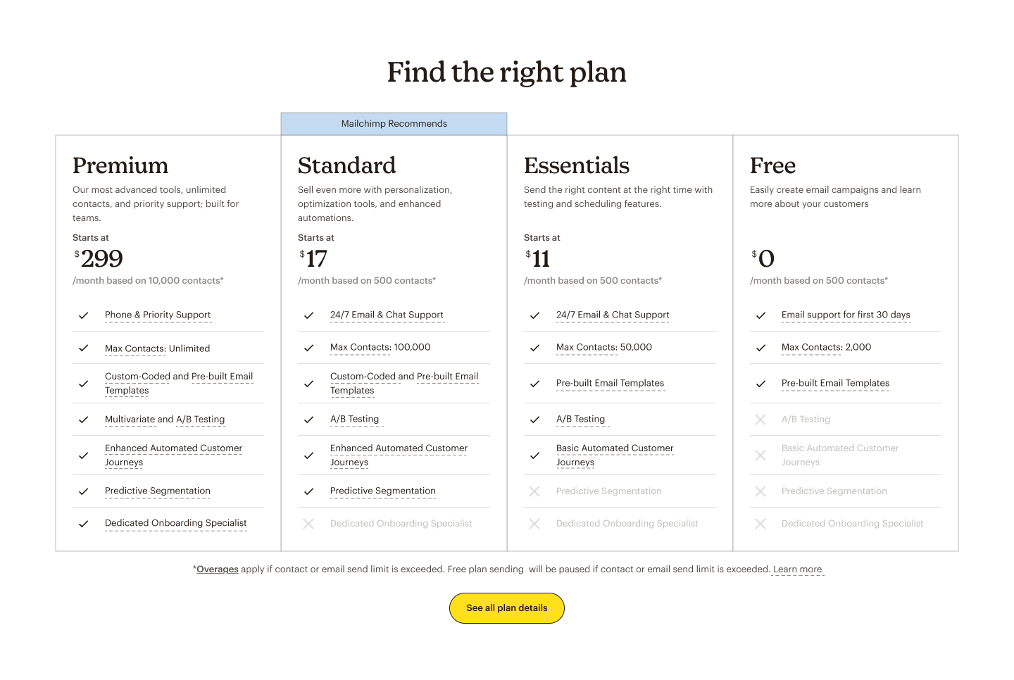
Milestone 1. Improving pricing page clarity

The previous design lacked clear differentiation between pricing plans, with pricing details disconnected from plan content. The new explorations focused on visually distinguishing each plan and integrating the contact count—the key pricing factor—directly into the module. These improvements led to a successful increase in conversions.

Before

After

Milestone 2. Increasing pricing visibility on other key pages

While exploring visual improvements to the pricing plan, I identified an opportunity to boost plan discoverability—only 9% of traffic reached the pricing page. I introduced a simplified module on the homepage and key feature pages, where users most often explore. This experiment led to a noticeable increase in conversions.

Milestone 3. Support decision-making through a guided quiz

Lastly, the team had long wanted to introduce a guided quiz to recommend a plan and help users gain clarity on which option best suited their needs. While promising in theory, the experiment didn’t yield positive results. I learned that users valued having a full view of all pricing plans side by side—being able to compare features directly gave them more confidence in their decision than being funneled through a guided path.

Outcomes

While not every hypothesis succeeded, the overall effort boosted activation and paid conversions—resulting in increased revenue, impacting 9M+ users

↗ 10%

Pricing page visits

↗ 10%

Activations from 9M+ annual traffic

↗ 11%

Paid conversions from 9M+ annual traffic

↗ 14%

Est. Revenue/user
(11M users)

Case study

Highlighting milestone 2

Skip to the end

Hypothesis

Increasing visibility of the pricing plans

Only 9% of our annual 9.6M site visitors reached the pricing page—the only place where plan offerings were clearly explained. If we increase visibility of our paid plans on the homepage and key features pages, then we will increase activations and paid conversion because prospective customers will have a better understanding of our monetization model prior to account creation.  

Goals

Help users
Understand what's offered in each plan and which offerings suit their needs

Help Mailchimp
Create effective acquisition funnels that increase activations, paid conversions and revenue

Metrics

Qualitative data
Pre-launching user testing

Quantitative data
30-day A/B testing

Design pattern analysis

Synthesizing patterns for early cross-functional team feedback

I synthesized design patterns from 90 websites and compiled the findings into a presentation deck, which I shared with 30+ stakeholders to gather early directional feedback.

Initial design POV

Distinct goals for homepage vs. feature Page pricing modules

After gaining team perspectives, I defined goals for home page and feature page pricing modules to guide my design explorations.
Home page

Simplify the module while maintain its intrigue

The module's information needs to be simplified for the home page and holistically introduce the pricing structure.
Feature page

Tailor to those with interest in specific features

Many users explore specific features on dedicated pages. However, the current feature page doesn't show which plans include those features.

Feature page

HMW tailor the module to those interested in specific features

Design explorations

Highlighting relevant plans/features

To meet the design goal, I explored two key approaches: 1. Highlight relevant plans that included the showcased feature. 2. Highlight the introduced features in the pricing table to reduce comparison friction and minimize cognitive load.

Explorations 1. Highlighting relevant plans

Explorations 2. Highlighting relevant features

Plot twist

Consistency over customization

After team discussions, we decided to postpone implementing customized modules due to the tight timeline, opting instead to focus on a universally applicable solution. However, the ideas were well-received and have been added to the roadmap for future exploration.
design

New and effective patterns

The team championed the design solutions due to their effectiveness and novel approach.
Data science

Hard to validate the outcome

Due to the relatively low number of visits on the key feature pages, it would take a considerable amount of time to obtain results from A/B testing.

Engineering

Tight timeline

With a dozen key feature pages, the design necessitates unique content for each, posing challenges for maintenance if future changes occur. And we faced a very tight timeline.

Home page

HMW create a universal module while maintaining its intrigue?

Design explorations

Details vs overview?

A. With feature lists

+ Allows customers quickly understand the key offerings to be interested
- Might be redundant if users simply use this module as a CTA to enter the pricing page

B. Without feature lists

+ Might trigger users to click into the pricing page due to lack of information and innate curiosity
- Might turn first-time visitors away due to lack of information

Evaluation

Option A wins: feature-based differentiation drives interest

Deciding what information to include in the home page pricing module was a challenge. To address this, we generated a list of questions based on the goals we wanted to achieve. Our researcher helped conduct 8 unmoderated tests. In the testing, we found that differentiation is more intriguing than lack of information.

Goal 1. Clarity

Measure. Comprehension of plan difference
Key question: How confident are you to choose the right plan?
Option A. 4/8 users are confident
Option B. 2/8 users are confident

Goal 2. Intrigue

Measure. Intent to visit high-converting pages or sign up
Key question: What would you do afterwards?
Option A. 6/8 would go visit the pricing page/create an account
Option B. 4/8 would go visit the pricing page/create an account

Iteration

Further differentiating pricing tiers with visual improvements

Testing also revealed an opportunity to better differentiate the plans upfront to spark user interest. I added cross marks to visually emphasize the differences between each plan.
Before
After

Meet constraints half way and avoid "dark pattern"

Constraint: We needed to ship quickly before the holiday season. In the final iteration, we removed the pricing calculator from the duplicated module based on engineering input and time constraints. However, usability testing with 8 participants revealed that the absence of the calculator led to confusion. To address this, I explored alternative copy solutions to clarify pricing and reduce misunderstandings.
The pricing calculator from the pricing page can not be reused across the duplicated pricing modules
Before
Option 1
Option 2

Creating 2 paths to conversion

Visual design

Visual revamp & responsive design

The site was undergoing a visual overhaul to target more established companies - "More mature looking and get rid of the Kale color". I explored the visual style of the pricing modules by collaborating with Mailchimp's in-house brand team. I also revamped 20+ pages across desktop, tablet and mobile devices.
Original 00 - Kale
Direction 01 - Pumpkin
Direction 02 - Cavendish
Direction 04 - Cornflower [Winner]

Outcome

Successfully passed A/B testing and deployed to all users

This marks the first instance of introducing pricing plans on both the home page and key feature pages. The 30-day A/B testing showed positive results. The new pricing module creates a successful marketing funnel to sign-ups.

Takeaway

Balancing tradeoffs, championing users

Effective communication with cross-functional partners helped me understand the diverse goals across teams in a highly interdependent project. It was equally important to navigate when to compromise—and when to advocate strongly for the user.

Zooming out to spark new thinking

As a designer, I believe in raising ideas—even those slightly out of scope—when they can help broaden the team’s perspective and inspire long-term thinking. Even if the changes we make now are small, planting these ideas early can shape more strategic decisions down the line.
Presenting my work to everybody at Mailchimp in the end 💛
Let's create things together!
LinkedIn | Resume | yalaipang@gmail.com
Built in 2024 New York ©️ Claudia Pang